Websites Evaluation
This afternoon we were given the task of evaluating certain aspects of 4 websites. The criteria we used was:
Presentation
We've also been asked to present a powerpoint presentation on one of the pioneers of multimedia design. The name I drew out of the hat was Donald Norman, co-founder of the Nielsen Norman Group (with web guru, Jakob Nielsen). I'll be posting about Donald soon.
This afternoon we were given the task of evaluating certain aspects of 4 websites. The criteria we used was:
- How easy is it to use?
- What audience is it made for?
- Is it a commercial/educational/entertainment product?
- Is it obvious how to use it, even before you click?
- Can you tell how it was made?
- What clues are there?
- Does it contain mostly image/text/sound?
- Are you satisfied with the way it works?
- Own Your own C
An appealing website at first, but soon gets annoying. First off, there's not much content, and it doesn't explain what the point of the website is - eventually, we found out that it was for an anti-tobacco campaign in California... Teenagers (the target audience) would get bored fast - I did. It was also a little slow to load, making it harder to maintain attention. 4/10. - Billy Harvey
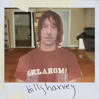 A nice-looking website at first, built in flash. I thought the navigation was superb, and the speed of delivery was remarkable considering the huge amount of music and images that had to be downloaded. Getting Billy himself to speak and his character to lip-synch the songs was amazing - a beautiful touch. I thought it catered to the target audience (his fans and intrigued music fans) brilliantly. The only bad things I could say about it is that the navigation could be slightly confusing at first, but once you click about a bit, you get used to it. Also there was no alternative content for viewers without the Flash plugin. 7/10.
 - Fly me to the moon
Once I heard the name of the website, I expected to be wowed, and I was. At first. The very nature of the navigation disappoints rather than make it fun, and while the animation is impressive at first, it gets boring soon. The flight to the moon is a good concept, but the inability to return to certain "docking stations" for information is annoying. Its not a website for most people as it's obiously aimed at the advertising industry. 5/10. - The Bad Luck-o-meter
The page itself is basic and appears to have been made in a rush, so it wasn't a surprise that we were meant to be evaluating the flash experience that it linked to. The Bad Luck-o-meter is a simple quiz about safety and insurance-based things. Concentrating on your home, its a brilliant bit of viral-flash magic. Being able to hear the questions made it easy on the eyes and allowed us to enjoy the amazing graphics. Easy to use and enticing, making you want to continue. While obviously commercial, its also obvious that it wasn't the final version - you couldn't finish the quiz! I can't wait for it. 8/10.
Presentation
We've also been asked to present a powerpoint presentation on one of the pioneers of multimedia design. The name I drew out of the hat was Donald Norman, co-founder of the Nielsen Norman Group (with web guru, Jakob Nielsen). I'll be posting about Donald soon.
0 comments
Add a Comment