Yesterday and today were were given 5 different products in order to evaluate Jakob Nielsen's Heuristics principles. Here's a paragraph on each and my personal score out of 10 on its usability:
- Go for Gold with KIT
"A visually stunning program to introduce children to the Commonwealth Games." (from R-E-M).
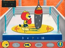 Built by B-Dag/Productive Play for the Manchester Games in 2002, this is a piece of absolute rubbish in my opinion - and that's without really looking at the technical aspects (that is, heuristics). It looks like it was done in a rush (and it probably was, though they still had a quite extensive team, from 2 companies, to build it). Maybe they hadn't tested it on their target audience (children aged 6 - 11). They'd have gotten bored with it fast (I did). When I played with it, I couldn't find the menu buttons (and they showed no signs of being menu buttons. There was help at hand... with the help of the Games' mascot, in a corner - I found it after I got bored, and I was more bored after hearing it. It wasn't in an obvious place, and it annoyed me - can you imagine what children would make of it? The clincher here was that the educational games weren't educational at all... they wouldn't reveal the correct answer after any amounts of attempts, and the questions (specifically the geography ones) were actually quite difficult, even for me (and I did it in GCSE's!!!). There's a longer and more detailed review here by Althea Samuels at TEEM, though I'd say she's evaluating a revised version of the program. 1/10.
 - EuroTalk "learn Italian" (circa 1996/1997)
A problem for us at the very beginning is that we couldn't get it to work - possibly because it couldn't match the minimum requirements (highly unlikely), possibly because we didn't have the correct permissions on the computer (very likely). We kept on getting an error when it tried to save information (after every task we completed). The design was confusing at first, but we got to grips once we messed around a little. There was a lack of consistency with the navigation, which made the task of learning Italian a lot harder. 5½/10. - EyeToy for the Playstation 2
A product with the standard that now expected from console games. Although there was not a lot of text explaining the way to navigate, it was intuitive, easy and fun to navigate. Help and documentation was at hand for anyone who got into problems, which appeared in entertaining animations and films. Feedback on the menu items were a little confusing at first, but you can realise almost instantly that you simply have to continue to tickle the button so that the graphic will turn full circle. The only downside was that there was no way to return to the main menu once you got nested deeply in other options, but I suspect this was intentional to keep its simplicity. 8½/10. - Being John Malkovich DVD menus
The nature of DVD means that if the DVD is being spun in the drive, there shouldn't be any waiting around. Once you got to the menu (which had to be done manually as it went straight to the beginning of the film), you see an appropriate menu with ugly, out of character buttons to navigate to extra features, language selection and to play the film. The most confusing of many elements of the experience was the little "i" button at the bottom of every screen, which led to the help menu (unfortunately, it was the only button that had no text label - the one button you'd want to see if you were in trouble). This "i" button led to a language selection screen, which you had to choose in order to continue... to a simple and pointless legend. There were also many inconsistencies all over the menu - it seems it may have been a job of multiple designers, perhaps given constraints by its studio in order to maintain its branding. 5/10. - SPECIAL 10 Issue 8 DVD menus
This DVD was the best of all the products we evaluated. Special Ten is a music, film and entertainment magazine thats published on DVD. The 8th issue DVD was an outstanding piece of design in my opinion - simple, intuitive, easy to use and addictive. Though there were animation in between menus, they were so stunning that I found myself clicking different menu items just to see the animation - rather that reading, viewing and listening to the content. The only thing that could be said against it is that the text wouldn't be readable by all. 9/10.
0 comments
Add a Comment